.png)
The Analytics dashboard shows how your verification requests are performing: how many you've sent, how many applicants finished, and how they verified. This article explains what's on the page and how to read each chart.
Before you start: If you don't see an Analytics tab in the left menu, analytics may not be turned on for your account. Ask your Customer Success manager to do so.
Opening the dashboard
- Log in to the Admin Portal at https://app.payscore.com/admin.
- Click Analytics in the left menu.
You can also visit your analytics here: https://app.payscore.com/admin/analytics
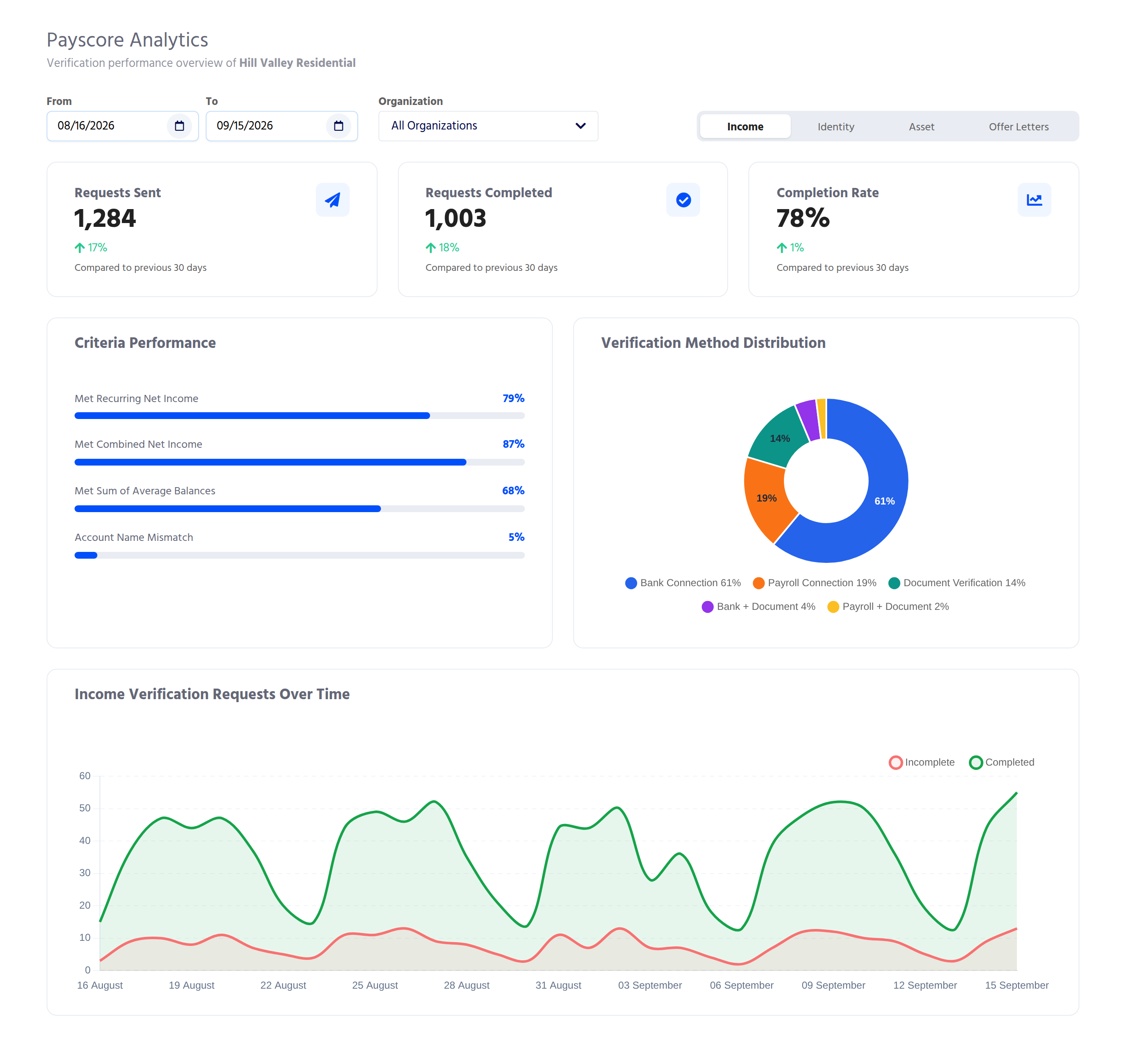
The dashboard opens on the Income tab, showing the last 30 days of request data.
Filtering the dashboard
Three filters sit above the charts. These filters control the shown data.
- From / To. Pick a start and end date. The dashboard counts requests created in that range. The default is the last 30 days.
- Organization. Shown only if your account has child organizations. Choose one to see just that organization and everything under it, or All Organizations for the whole account.
- Product tabs. Switch between Income, Identity, Asset, and Offer Letters. A greyed-out tab means that product isn't turned on for the organization you're viewing. The Asset tab only appears for affordable housing accounts.
Tip: the tab and organization you pick are saved in the page address, so you can bookmark or share a view. The date range isn't, so a shared link opens on the last 30 days.
The headline cards
Every tab starts with three cards.
Requests Sent
Verification requests created in the date range. Each applicant counts once, so a household of two counts as two requests.
Requests Completed
Requests where the applicant finished verifying.
Completion Rate
Requests Completed divided by Requests Sent.
Under each number, an arrow and "Compared to previous 30 days" show the change from the period just before your date range, for the same number of days. No arrow appears when the previous period had no requests.
The Completion Rate arrow shows how much the rate itself changed. If completion moved from 40% to 50%, the arrow reads +25%, because 50 is a quarter higher than 40.
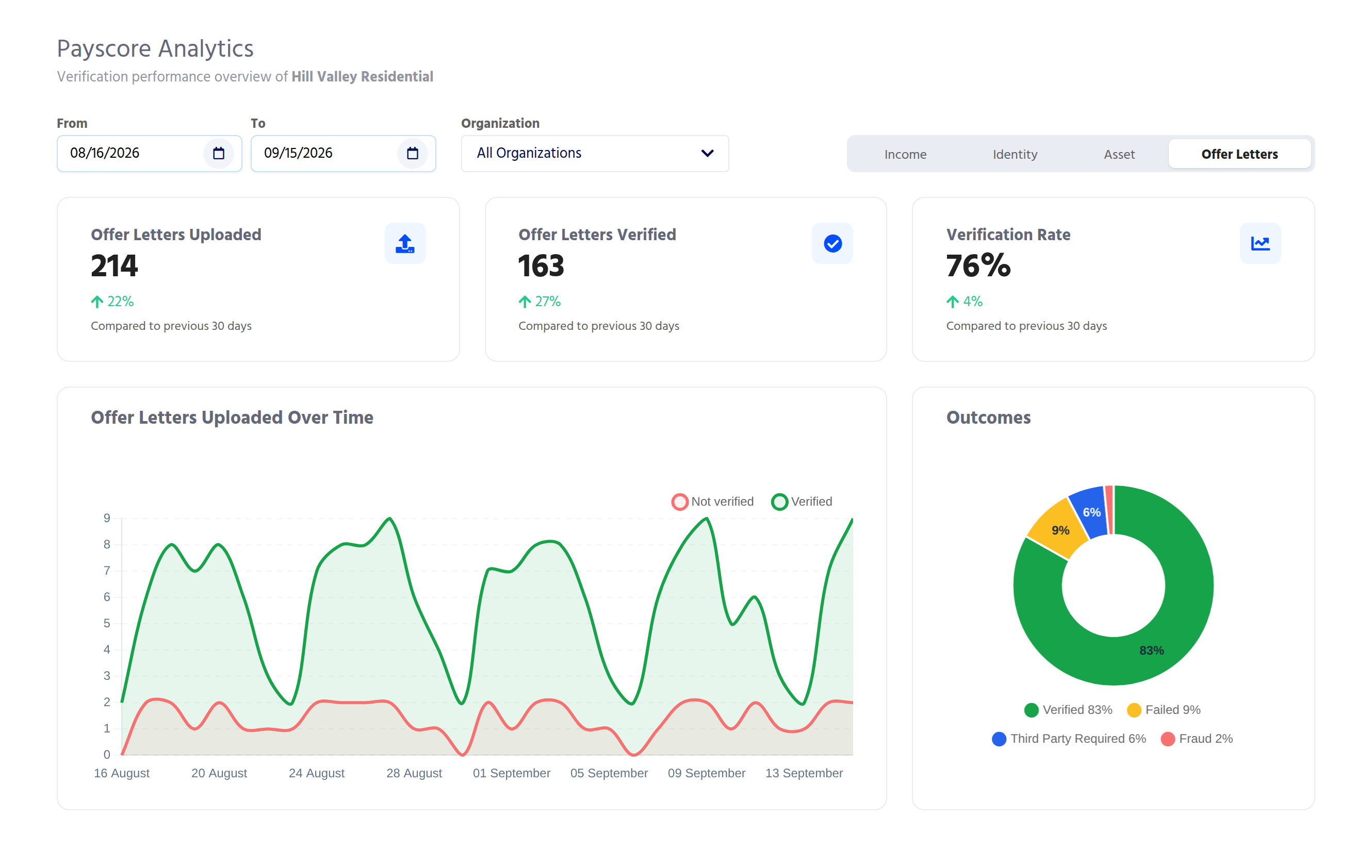
On the Offer Letters tab the cards are named Offer Letters Uploaded, Offer Letters Verified, and Verification Rate. "Verified" means an employer confirmed the letter.
Requests Over Time
This chart shows requests by the day they were created. Green is completed, red is incomplete. Hover over any point to see the exact counts.
For ranges longer than a month the chart groups by week, and for ranges longer than about three months it groups by month.
Income tab
Verification Method Distribution shows how applicants who completed verified their income:
- Bank Connection: linked a bank account.
- Payroll Connection: linked a payroll provider.
- Document Verification: uploaded pay stubs or bank statements.
- Bank + Document and Payroll + Document: used both.
Criteria Performance shows the share of completed households that met each of your income criteria. Only criteria your organization uses appear. For example, Met Recurring Net Income is the share of households whose recurring income met your income-to-rent requirement. Account Name Mismatch is the share of households where the name on the account didn't match the applicant.
If your organization doesn't use income criteria, this card says so.
Identity tab
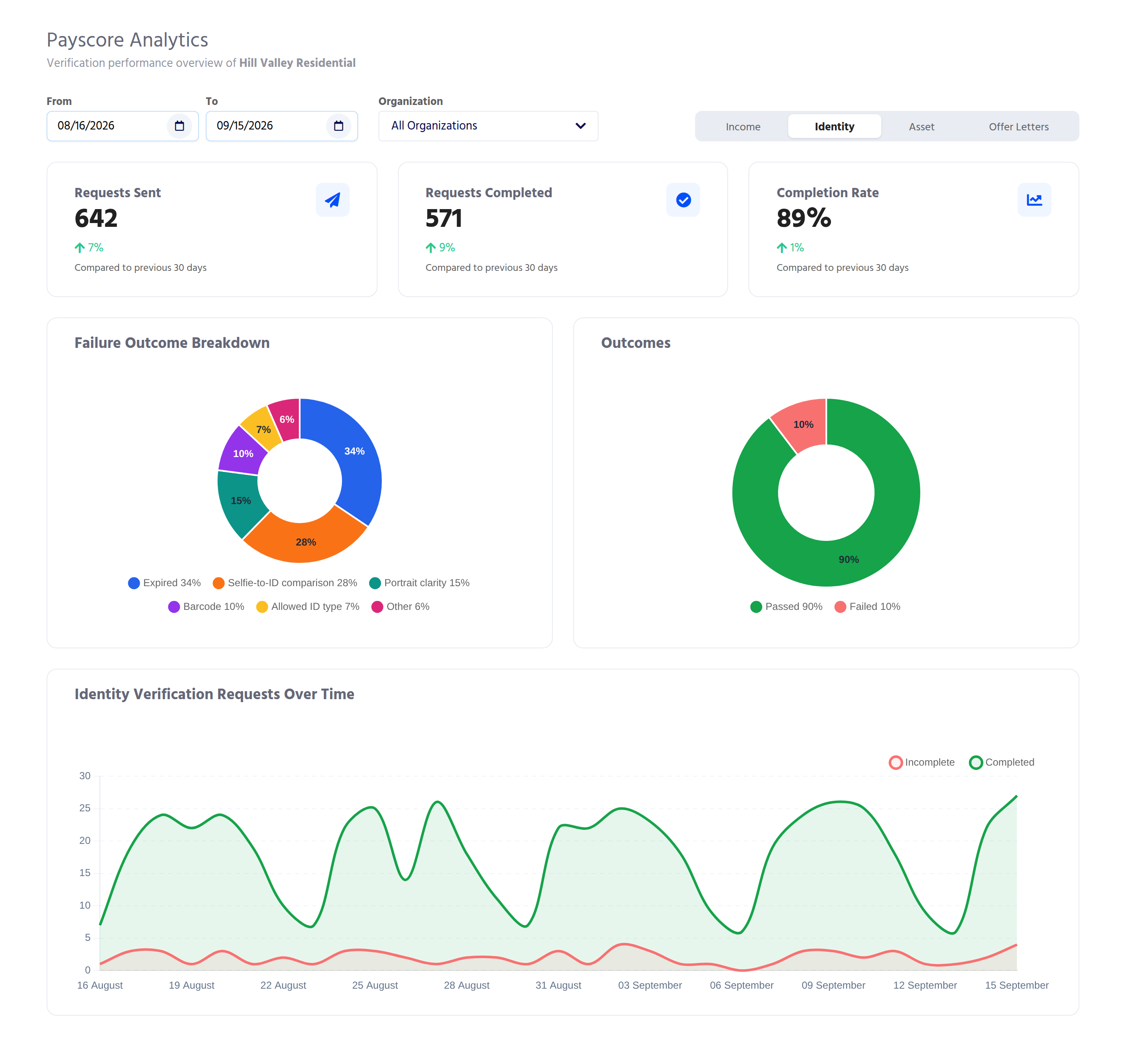
Outcomes splits completed identity verifications into Passed and Failed.
Failure Outcome Breakdown shows which checks failed most often, such as an expired ID or a selfie that didn't match. It counts checks, not applicants: one applicant who fails two checks appears in two slices.
Asset tab
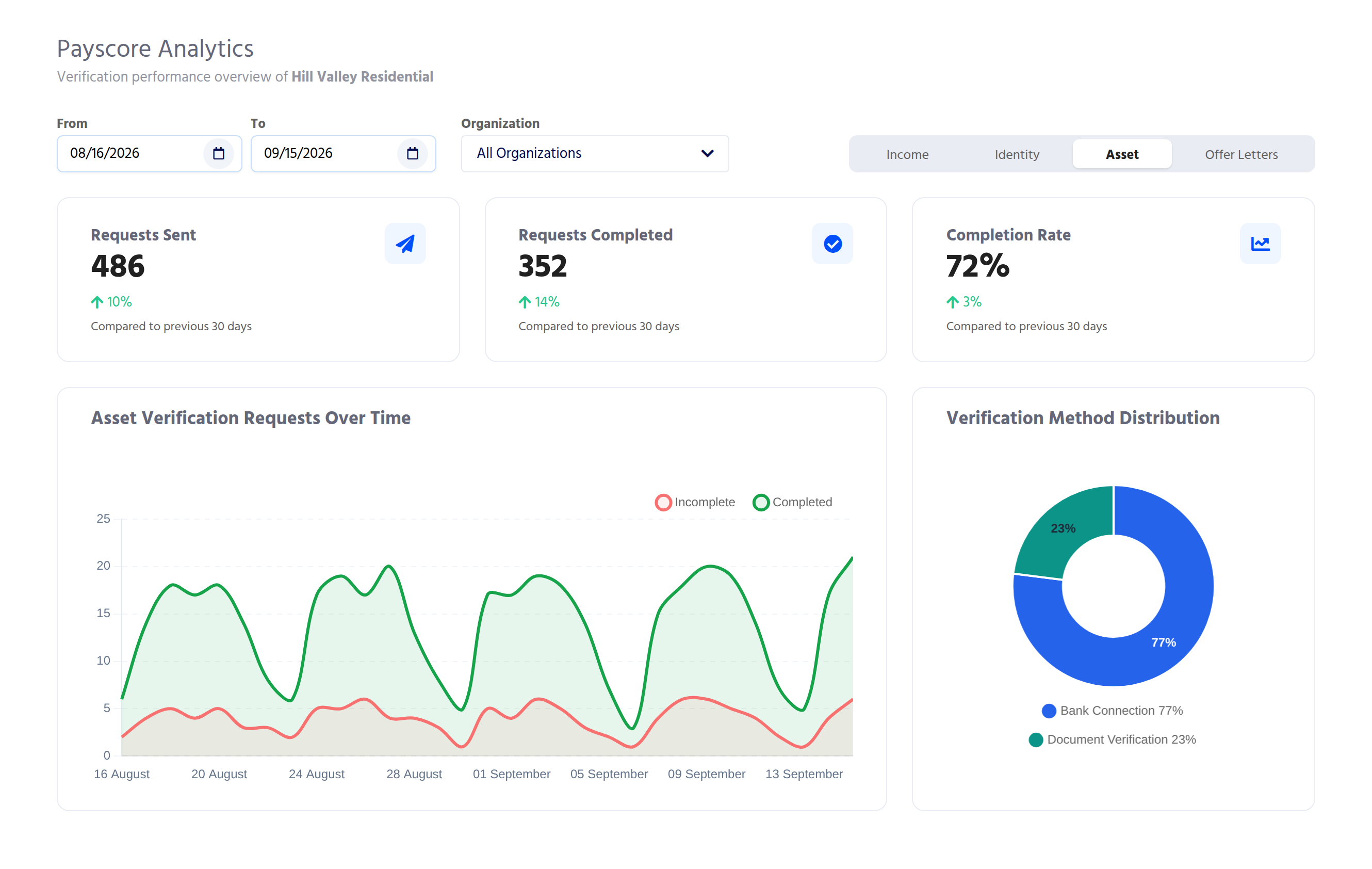
Verification Method Distribution shows whether completed asset verifications used a Bank Connection or Document Verification.
Offer Letters tab
Outcomes shows how each letter finished: Verified, Failed, Third Party Required (the employer needs to confirm through a third party), or Fraud. Letters still being processed aren't in this chart yet.
Why don't my numbers add up?
- The pie charts total less than Requests Completed. Breakdown charts only show the categories listed. Completed requests that don't fit a category, such as an offer letter still waiting on an employer, aren't drawn.
- The chart starts after my From date. The chart begins at your first request in the range. Days before it are left off.
- The numbers just changed. The dashboard refreshes about every 5 minutes. A verification completed a moment ago may take a few minutes to show.
- A tab is greyed out. That product isn't enabled for the organization you're viewing. Contact your Customer Success manager to add it.
- Nothing shows. Check that your From date is before your To date.
Still stuck?
Contact support through the chat in the Admin Portal or email support@payscore.com. Include the organization name, the date range you selected, and the tab you were viewing.


